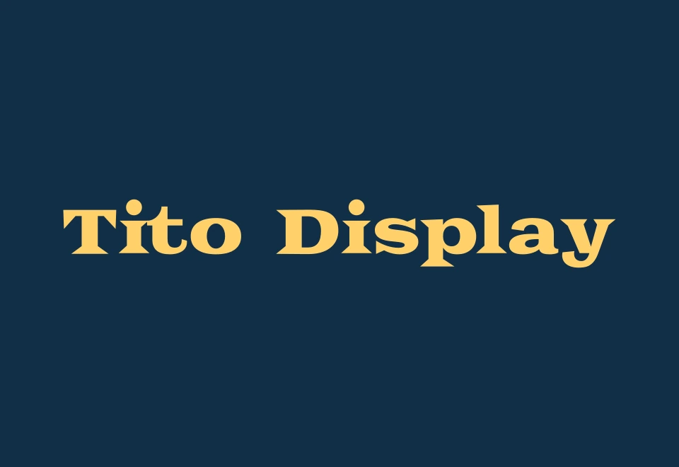
Tito Display
Designed Typography
A wide, heavy display serif inspired by Tito Rodríguez, the Palladium, and the rhythm of mambo.
From the Palladium to the page
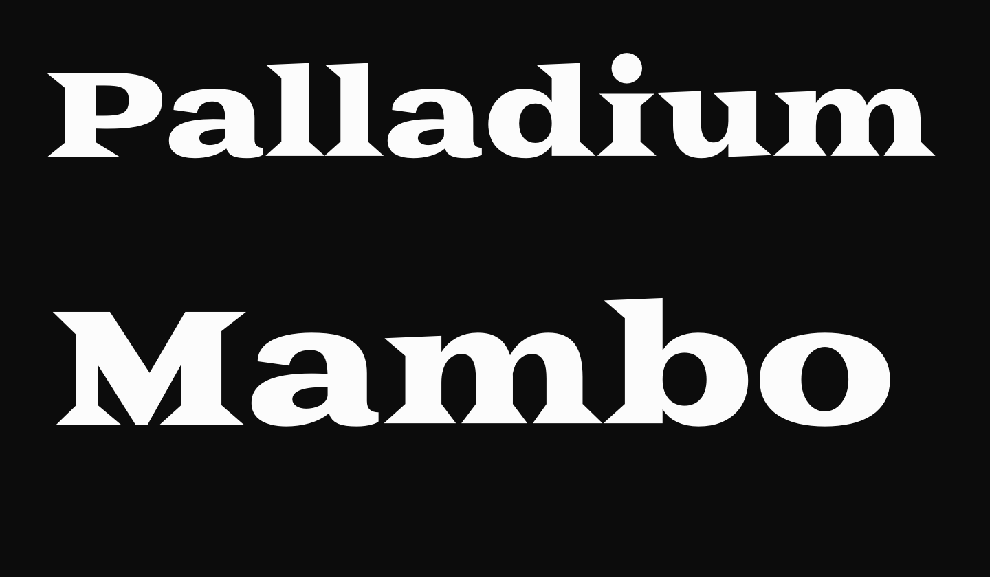
I designed Tito Display for an HONORS 212 project. I was looking through American Sabor when I came across the cover of Tito Rodríguez Returns to the Palladium—Live! The lettering had the energy I wanted to capture: broad proportions, sharp serifs, and a rhythm that carried across the whole line.
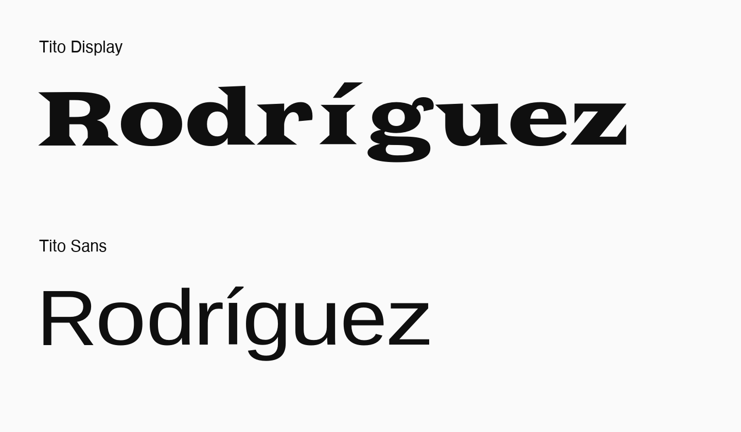
I made Tito Display the louder voice of the pair. Its wide letters and wedge-shaped serifs give short headlines room to move. Tito Sans takes the companion role with quieter forms. These specimens use the original 2021 fonts.
Try Tito Display
ROLE
Type designer
TOOLS
Adobe Illustrator
PURPOSE
HONORS 212 final project
TIMELINE
2021